About Me

My photo
Out of the hundreds of sketches I make and digitally rework. I probably post less than 5%. I draw mostly from imagination so proportions tend to be off sometimes, if you look at that sort of stuff.

12/8/10

Graphic Novel Review


Graphic Novel Review
Sandman Preludes-Nocturne

By Neil Gaimen
Color print
Hand-drawn with collage book covers
Comic book style of framing
Certain dialogue spoken from distinctive characters have their own special font and stylized speech bubble.
Text and visuals tend to balance out in this novel, though certain parts are a bit wordy.

The theme  of Sand is change
Setting/Location is based on Planet earth, and various locations and/or Afterlives

What’s going on?
We follow the short stories of various characters and their encounter with a God-like character known as Morpheus


Spotlight on examples, scene by scene:
 Sandman is given the key to Hell by Lucifer, which is then sought after by various Gods from all Religions and Mythos.

Past/present, future, which tense and written in which person:
The graphic novel is written in Present tense but calls back events long since passed. This style is similar to Watchmen.
Tone/mood:
Dark, but hopeful.

Flashbacks/shock tactics:
There are many powerful figures that Sandman must deal with, leaving its readers on the edge of their seat.

Elements of storyline, character, conflict, etc:
How the almighty is humbled through the course of the story, with mini conflicts and many temporary characters that either “live happily ever” after or become deceased.

Personal reactions, explain.
Like/dislike
Story to change your life?
Read more of same?
Why did you choose it?

This Graphic novel evokes many questions that don’t have a simple, or rather an immediate answer. And the conclusions only puzzled me further. Nonetheless this is a great narrative and a very interesting character. This book, in a way, changed how I look at dreams and what they mean for people. I intend to read all of the volumes thanks to the recommendation of the series by my Roommate, who is an avid comic book reader.

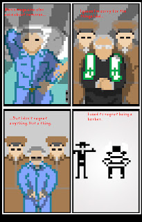
Pixel version of A man who wasn't there


10/30/10

Eddie The Hedgehog

WARNING!: Eddie the Hedgehog video/storyboard assignment. Looks much more interesting when opened up in flash than on youtube. Enjoy at your own risk.

10/28/10

Wordless Comic

I'm not entirely sure is shirt logos count as words for this assignment. But other than that. The goal of this was to include a three member family, a wall/fence, water, and a hidden object all in 9 panels. Oh, and it had to be funny. So if you don't laugh, then I lose points : P

You've Got Mail Comic


9/29/10

Netherlandish Proverbs

Note: Most of the creative and technical work came from the very talented artist, Kimberly Tam! That said, I'd like to post this on my blog anyways.


12 scenarios

The 12 scenarios assignment is made up of four different scenarios out of the twelve. Panel 1) depicts how the Universe began (with a game of hungry hungry hippos of course). Panel 2) depicts how the Universe ends. Panel 3) is a self portrait. And panel 4 is something that happened to me that morning (don't worry,I'm all better now). So the sequence goes top down, left to right, it can be read at least 2 different ways.

I used to believe... But now I know


I hope the art doesn't hurt you're eyes too much. I just started using flash last week so... enjoy?

9/28/10

Graphic Instruction

This post is all about acknowledging the way images serve to inform the public in everyday life. We often take this for granted without knowing the subtle messages behind these images and signs. Just imagine, if you will, that everyone began speaking in tongues and verbal communication was no more. The first medium of communication to be established would most likely be images, or visual cues.


Take a look at the airplane safety pamphlet for a moment. Without reading a single word you can already tell where the life jacket is located (above left). Instructions wouldn't be very effective if they had nothing but text.
 Now take a look at the Sparking Craft image. What might be wrong with this image? Well, for starters, the text on the page takes up more space than the images at the bottom of the page, which have even smaller text underneath them. Not to mention that if you read the instructions carefully you'll probably be more confused (trust me on this one, it's pretty terrible). There is a formula somewhere that shows us the optimal way to inform someone.
Good instruction = (big pictures + big font) - tons of pages (don't quote me on this tho).
In fact (if my theory on laziness is correct) with less text and more images, readers are more likely to read all of the available instructions on any piece of information. Why? Because it's an easy read that doesn't take up all their time! That's it for now folks.

My mindmap


Mind maps for graphic storytelling. This is image is meant to tell you how to clean your glasses (assuming the reader wears glasses). Start from the top of the page and follow the arrows. Not that complicated really.

9/8/10

What's with the title?

So... if you're asking yourself why I decided to name my blog "The Que". This post is meant to answer such a question.
 So before child labor laws were enforced, I was employed at the rugged age of six. I worked as a waiter in a barbecue restaurant run by my Uncle.  This was the year that I learned for myself how the real world worked and the importance of earning money, only instead of money I was paid in Layers... of trident gum (literally). It wasn't until I turned nine years old when the restaurant decided to lay off a few of their "employees". But no hard feelings right? Well... since the working experience, all of my employers since then have found ways not to pay me in cash. So technically I've never worked a day in my life. Which brings me back to the reason for picking this title in the first place. I think it sounds cool... no seriously, that's all there is to it. Blog needed a theme and there it is!


P.S. If this post changed your whole outlook on life, in any way, feel free to pay me in gum.